Advertisement
Click to download now, finish the installation quickly, and directly unlock the "all-round experience"
Advertisement
Screenshots
Click to download now, finish the installation quickly, and directly unlock the "all-round experience"
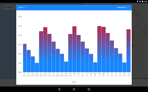
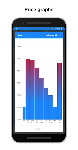
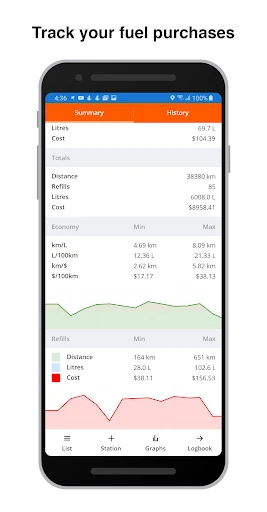
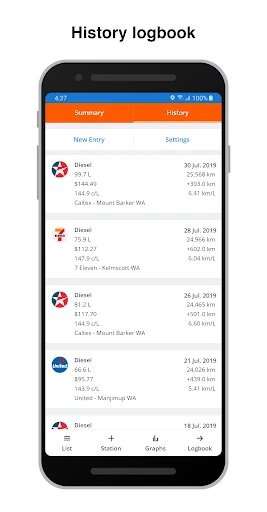
Fuel Map Australia stands as a cornerstone utility within the Travel & Local category for the Australian market. By synthesizing crowd-sourced community data with official government feeds, it provides a comprehensive and dynamic map of the country’s refueling landscape. It serves not just as a directory, but as a real-time financial tool that empowers motorists to navigate the volatile fuel cycles of Australia with confidence and precision.
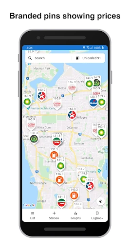
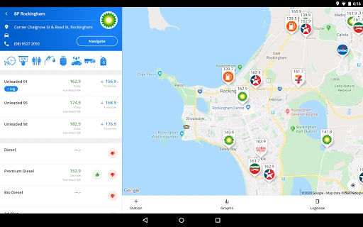
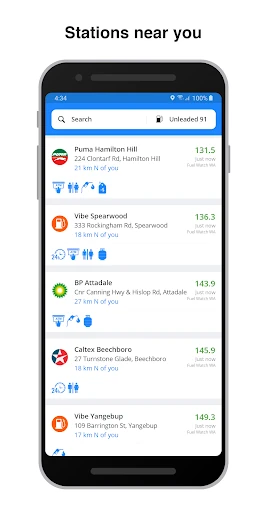
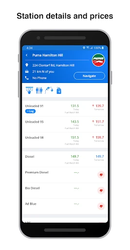
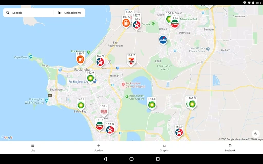
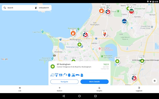
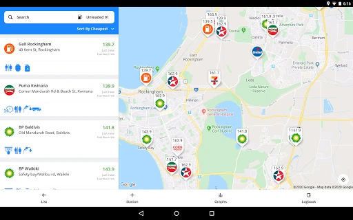
The interface of Fuel Map Australia is built for utility and speed. Its map-centric design is intuitive, utilizing familiar gestures to navigate the vast Australian geography. The "slide-in" site list is a particularly effective UX element, as it bridges the gap between spatial awareness (the map) and quick comparison (the list), allowing users to find the cheapest nearby fuel in seconds. While the aesthetic is functional rather than flashy, it prioritizes legibility and information density, which is critical for users who may be operating the app in high-glare vehicle environments.
To further elevate the platform, the developers could implement a "Price Verification" badge for crowd-sourced entries to increase user trust. Additionally, integrating a trip-planning feature that identifies the optimal refueling stops based on a user's specific route and vehicle range would move the app from a reactive tool to a proactive travel companion. A dedicated dark mode would also enhance usability for night-time drivers and long-haul travelers.
Fuel Map Australia is an essential download for anyone traversing the Australian continent, from daily city commuters to "Grey Nomads" on interstate expeditions. Its ability to save users significant money at the pump through transparency and forecasting makes it a best-in-class utility. For motorists in WA, NSW, and QLD especially, it is an indispensable asset for navigating the daily fuel market.